We both know why we’re here.
We’ll start by showing you the ropes. You already know video is important for your destination marketing pages-sure.
Who doesn’t?
But what kind of video? How long should it be? Where does it belong? And how can you be sure you’re positioning yourself to maximize your conversions?
Let’s take it slow.
Pull up your social media networks. Everywhere you look: Anyone from Uncle Buck’s cousin to Ralph Lauren’s nephew is using video to captivate their audience, and it’s working. That should tell you something: Considering to mirror consumer behavior might be something you’ll want to consider. But is it effective? And is it necessary for your landing pages?
What’s it going to be?
We’re more captivated by things in motion. Our modern audience of multi-taskers can take in a video faster and easier than a wall of text. And the payoff can be greater: In some cases leading to conversion increases of 60%. Does this mean you shouldn’t focus on copy for your promotion efforts? Hardly: we’re simply talking lead-gen landing pages here. Your clever choice of word comes into play in the very beginning (emails, blogs and ads that land your consumers here in the first place) and the end (your main headline and supporting descriptions that live aside your video essential for the overall clarity of your page) of your lead-gen process, and within the videos themselves. We’ll touch on more of this below.
So what kind of video are we talking?
We’ll break it into two categories for the destination marketing world:
1. Destination Features
Descriptive videos such as destination explainer videos that may live within the page (frequently “Meet [Your Destination]” promo overviews) and give a tactful, textural sense of what it’s like to experience your destination.
These can live within site headers or be featured next to your form
Atlanta Citywide Meetings lead-gen page produced by Digital Edge
Where does it belong? Landing page videos can be embedded within headers to draw and hold attention to main messaging, allowing the user to take in supplementary information at ease, before becoming comfortable enough with your brand (see: Accolades, Proprietary Information on Expansions, Social Proof, etc.) to take advantage of filling out your form (It goes without saying: Just make sure the offer is compelling).
2. Explainers
For giving the viewer a promo overview of either potential promotional offerings or pleasurable secondaries to further coax them into filling out your form (Yep, it’s the third time. We’ll get to form later. Promise.)
Travel Portland Meetings lead-gen page produced by Digital Edge
Where does it belong? There’s a good argument for landing page videos being above the fold. Unless your video is part of your pleasurable secondaries and stands only supplemental to your overall destination perception and message, it’s a good rule of thumb you’ll want it on top.
How long should it be?
Depending on who you ask, you have about seven seconds (It’s not an exact science) to do the job of capturing your average consumer’s attention. Against common belief: It doesn’t matter, within reason. However, here’s the ticket above all else: Make it compelling. And, if you can, make it quick. Take this in:
1. Perusive Films
65% of people that watch the first 3 seconds of your video on Facebook will watch it for at least 10 seconds, and 45% will watch a video for 30 seconds1. If you’re speaking to meeting planners, consider stating such in the first three seconds. Given the data, it’s a no-brainer, really. If not in the frame of the action, somewhere on the page in clear view.
Let’s narrow it in. In regards to destination features, with video headers, it can be preferable to run shorter loops, touching on the most important, captivating video imagery pertaining to the experiential nature of the promotion itself. On the other hand, for explainer videos, you’ll want to put more of a focus towards getting the point across in cryptic form both for those willing to watch and for those willing to listen (You can’t depend on audio to do the full trick).
Be all that you can be
Include a call-to-action. Consider varying its placement if your video is on loop to ensure you urge the user throughout the entire interaction to interact with your form.
Utilize UGC imagery for site visit campaigns alongside your video to increase the validity of the campaign. Is it the first time? Utilize your social photos or other destination imagery to frame the experience, and focus efforts on creating original content for future campaigns with video production. If it centers around a FAM Tour (put in a link in future to FAM Tour services page when live), be sure you utilize the video for future landing pages, like this promo video we produced for Rapid City or this event production for Visit Park City.
Not running a promotion? Be sure your pages take advantage of your assets whenever and wherever they possibly can and, in some cases, you can do it all in one place.
Analyze your layout. Take advantage of services to get a keen eye on where your consumers are touching your page. Analyze your findings and make adjustments.
Great form
When possible, keep your call to action stout and front-and-center.
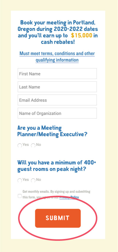
Keep your fields short. You’re just looking to give them a taste of your destination first. You can deliver further valuables about your destination once you have the lead intact.

Finishing strong
It can seem like a lot. We’re here to help you navigate through.


