First things first:
Casper is a small town in Wyoming. But what it lacks in size, it makes up for in a unique assortment of outdoor adventures and a rich history rooted in Western hospitality. With safety measures securely in place and the Casper Events Center and surrounding saloons waxing flexible, Visit Casper decided to eyeball a meetings campaign. They needed a sharp-shooting agency with experience in bringing the cows home.
Our hands steady on the holster, we built a strategy and pulled the trigger.
We needed to develop a tone and look that matched Casper’s “can-do” mindset. If there was ever a time to be bold, the time is now.
Casper’s landscapes are wide open. Their town is wide open. Their people are determined. But don’t mistake a steadfast regard for progression for rigidity. Their hearts are wide open, too. They’re ace-high and friendly folk.
Campaign Messaging
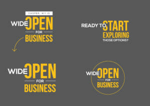
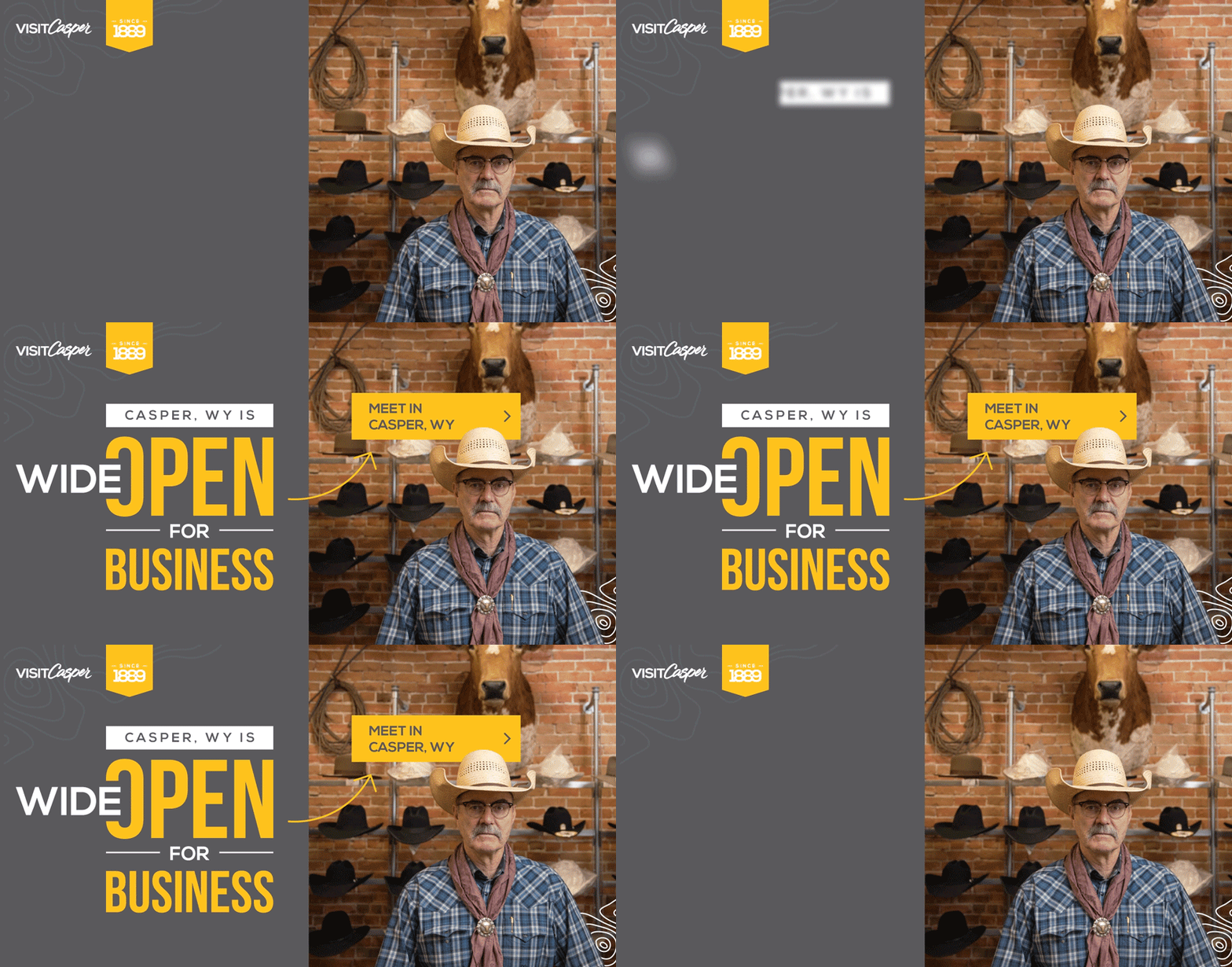
The challenge of portraying a bold and determined yet welcoming destination was met with faces of the town, bright colors and bold typography with clear, concise messaging branded into the fleet.
We didn’t come to mince words. And neither did Casper.
With their language as straight-forward as their disposition and authenticity, it was time to cut to the chase and tell it like it is.
Giddy-up.
P.S. We can send the cavalry to the rescue to your town, too. It’s what we do.
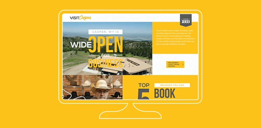
Landing Page
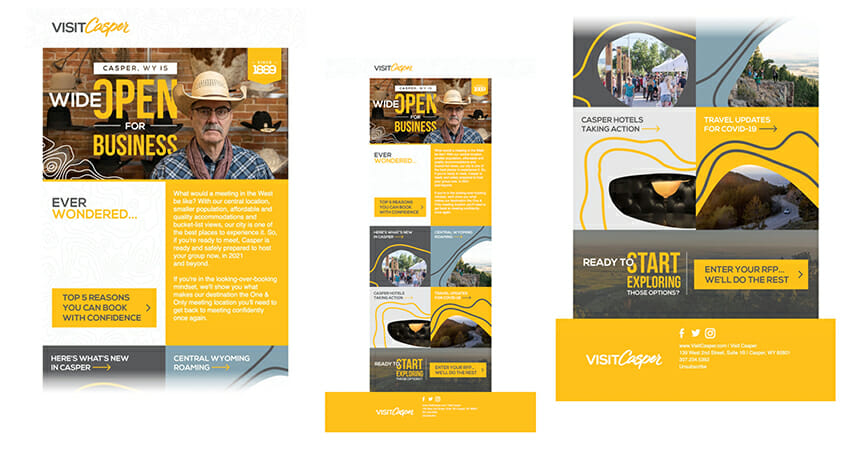
Email Design
